Branding for a alcohol trademark

President

Branding for a vodka trademark

President

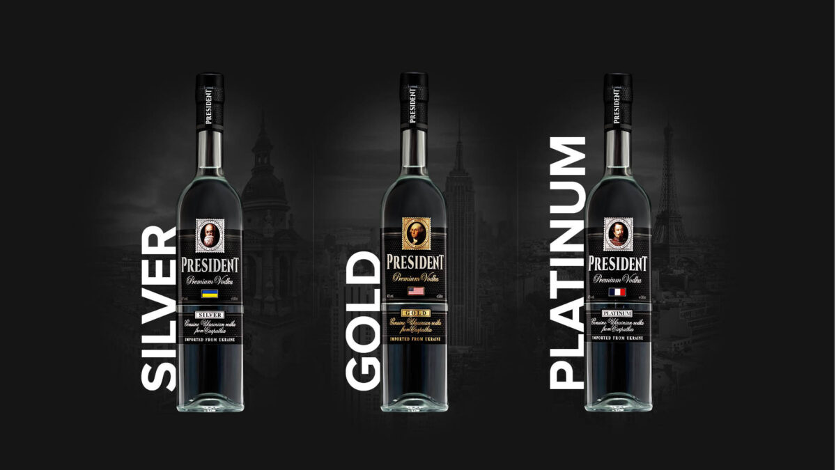
A brand of horilka President is presented on the market under three names: President Silver, President Gold, and President Platinum. He can rightly be considered one of the leaders among alcohol producers, and President’s products are on the shelves of supermarkets of major retail chains.

Positioning. Since 1782 

“A premium brand of horilka, with a unique history” is the primary message to the brand’s customers. We had an original old recipe and the factory’s history, so positioning based on “historicity” became the best option.

The brand story

An ancient recipe book in the laboratory archives of the plant, where the primary recipe was created and adapted to modern technological production requirements, is the starting point for the brand story.

«The high-quality horilka by President is produced in Lviv. The city’s tradition, history, and culture of alcoholic beverages production are the oldest in Europe  – since 1782! For more than 235 years, Lion city has been preserving and improving the technology of making horilka according to traditional and original recipes. Resident horilka came out thanks to an extraordinary discovery. In the laboratory archives of the distillery, they found the book “Horilka” (“Gorzelnictwo,” 1895, Lviv), describing the experience and recipes for industrial producing and purifying horilka. According to one of the recipes, adapted to the latest technology, Resident horilka was created. The date of this recipe almost coincides with the beginning of the world history of the presidency (1789). In many countries, presidents replaced monarchs during the eighteenth and twentieth centuries. In earlier times, horilka from Lviv was delivered to imperial and royal courts, and now it is put on presidential tables».

Work on brand corporate style

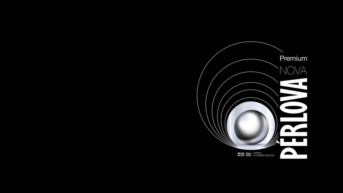
We decided to use colors that have already become classics in the spirits industry – gold, silver, white and black. These colors harmoniously combine with redrawn illustrations from the ancient book. In this way, we made the historicity of the brand and its relevance collaborate.

The corporate identity provided ready-made solutions and visual examples of branding elements for several groups at once: consumers, partners, HoReCa, and retail.

Retail-branding

Our agency developed the design of trade counters for product presentation in the network of branded stores of TM “Hetman” and duty frees at airports. During the work, we tried to fulfill the requirements of the customer:  

  1. Maximum use of the minimum area (60 x 60 cm);
  2. Expensive and prestigious look.

We also thought about the ergonomics and practicality of the racks, so we made them in the form of ceilings. So access to products is possible from all four sides.

Branding of prefabricated structures – racks for samples of products used at trade shows or for retail partners. 

Advertising campaign and video production

Before the TM entered the market, we launched an advertising campaign with the slogan “Find time to meet! We are meeting the PRESIDENT” for rotation on central TV channels.

  • Develop a script and communications for the brand’s entering the market.
  • Shooting and producing a video.
  • Through the repetition of the name “President”, create an association with alcoholic beverages, and spread it among the target audience.
  • Customer’s wishes: cold and snowy weather in the frame.

The result: Find a slot for the meeting! We are meeting the з “President”

This video is a part of set of three commercials an advertising campaign prepared by MOROZOV.agency on the occasion of the launch of the Hetman distillery, horilka from President TM. To explore all set https://eu.morozov.agency/president-vp-2/

The School Where Miracles Happen

«Ecoland» school network

«Ecoland» school network

The task:

  • Develop a script and shoot a Christmas promotional video.
  • Gamified plot with an emotional component.

The result

An imagery Christmas video is an effective tool to increase customer loyalty. But it wouldn’t be quite right to invite-only children who study in the network of schools “Ecoland” for filming. We have created a story about mutual aid telling that miracles seldom happen by themselves. Sometimes it is worth creating a miracle for your neighbor. Whether it’s a gift under the Christmas tree, a sign of attention, a smile, or a “high five” (they say tutors and teachers still greet each other in this only way at school 🙂

“Miracles. Oh, those miracles! We look forward to them regardless of our age or season because we are all dreamers. But, you should agree, that a miracle will not happen if we do not create it for each other. Ecoland Lyceum is a school where miracles happen.”

Backstage

The weather often fails our shooting plans, but the film crew took care of everything. A few bags of salt, snow machines, and Christmas decorations helped to capture the material in the fall as we needed to prepare it in advance. The children played the roles of themselves.

Branding for CIT IT & Media school

«CIT»

Branding for CIT IT & Media school

CIT

CIT IT & Media school is a territory of innovative learning for everyone! 

CIT Media School offers courses for teenagers and adults in many media fields: photography, journalism, computer literacy, graphic editing, and public speaking.

Moreover, CIT is coworking. Here you can rent halls for presentations, training, master classes, seminars, and lectures.

Insight. Slogan

Highlight and stand out

Here’s how we implemented the idea in the logo.

  • Authenticity: the cursor is stylistically similar to the unique letter “i”.
  • Dynamics: the logo symbolizes the continuation and movement: the cursor is leading the line.
  • Content: the cursor highlights the letters “IT” – one of the main activities of the brand.

Building a logo. A sequenced asymmetry

Although the logo seems to be asymmetrical, its borders form a square. In the internal construction, you can see the symmetry and order. We have achieved this, in particular, by using equal spaces between letters and other elements of the logo.

There is a variable text box on the logo. Its content can be different depending on the media and current needs. For example, this field may contain the text of a slogan or a website address.

Corporate colors and monochrome version

Advertising images creation

Learning is always an exciting process that opens up a world of new knowledge and opportunities. Therefore, working on the interior of the educational complex, we used images that are dynamically breaking into the world of change, and motivational inscriptions.

Navigation pointer system design

We developed a clear and understandable system of signs for the educational complex’s visitors. It simplifies navigation and helps to find the right audience or space.

A visual marker and key visuals

The cursor became part of visual identification and was successfully integrated into brand content. This element cooperates with blue dice: highlighted text headers and the primary communication messages or translucent separation of part of the image.

CUP CLUB brand creation

Cup Club

CUP CLUB brand creation

Cup Club

MOROZOV.agency face the task of creating a brand for the new company, a vending network of coffee machines. The company itself did not position in the market before. So it all started from scratch.

Naming

Cup Club — the club of grain coffee connoisseurs.

The work on company’s positioning

Cup Club — is a club of grain coffee connoisseurs who meet the morning with a cup of fragrant drink in hand. Cup Club — mot just a vending coffee machines company, but an active community who need energy during the day and find it in a cup of aromatic coffee

Logo Development

Hipster key visuals: for everyone

Urbanism, modernism and hipsterism became the key images. 

We decided to abandon the banal picture: a cup of coffee near half-open lips and snow-white teeth. After all, different people drink coffee. That’s how the idea of using black and white characters, various in age, appearance, and character, came about. They do not look at the camera because they aren’t aimed to persuade you to buy coffee. They know you are with them: you are also in the “club”.

Retail and the key visuals 

We used three colors for branding Cup Club vending machines: corporate red, black, and metallic silver.

Since the customer is in direct contact with the coffee machine, it was vital to choose the materials carefully. We have used expensive technologies, such as ultraviolet printing and metal film coating. The reason is simple: coffee machines have an attractive appearance and impact the associations with the ready-made drink. It seems that coffee from such a machine is twice as tasty!

Campaign: Best wishes from Ukraine

djinni.co

Communication message: Best wishes from Ukraine

djinni.co

The djinni.co web service is popular for anonymous job search and recruitment in the IT field. User contacts are not published, so you can easily look for a new job without worrying about the current employer’s interests. Thanks to this feature, the site has gained a lot of popularity.

There are two types of users on djinni.co: job seekers and companies/recruiters looking for professionals. Maintaining a balance between applicants and recruiters is among the main tasks of the service.

This case was created for advertising communication at specialized foreign exhibitions, where representatives of djinni.co promoted the service among recruiters.

Specialists from Ukraine are quite popular in foreign markets. Therefore, the purpose of this campaign is to draw the attention of new foreign recruiters to Ukrainian specialists in this service.

Together with the customer, we thought about the advertising slogan and suggested a greeting as the most appropriate format. It conveys two important messages: 1) the service is ready to cooperate with foreign companies; 2) it has an extended base of Ukrainian specialists.

Best wishes from Ukraine

A fingerprint image consisting of zeros and ones (binary number system) and the address of the site djinni.co has become the visual key. Of course, anonymity when looking for a job is the basis of the company’s positioning. But there is a need for the identification of a specialist at the stage of the interview.

The visual key is ready. It helped to distinguish the company qualitatively from its competitors at specialized events. However, our client also sought to attract more recruiters. As they say, image is not the only thing. It took something else for potential recruiters to come to the service and evaluate all its benefits.

«Djinni is already a gift for recruiters»

This is exactly what we wanted to say in a live conversation with recruiters at exhibitions. The customer picked up our agency’s idea to develop gift cards in the form of greeting cards. The service itself is a gift, because at the stage of search it is already free for recruiters, so no discounts or special offers are needed.

We left the call to register on the site, and wrapped it as a bonus: if the client registered on the service within a week after the exhibition, he gained free access to the analysis of the Ukrainian IT market, prepared by the company djinni.co.

The concept design of the label

ТМ «Perlova»

The concept design of the label

ТМ «Perlova»

There’s a long story about MOROZOV.agency’s design process on the Perlova horilka label. But it seems to be the case when you need to just watch and enjoy.

«Perlova» trademark is a premium horilka brand with a history. The purity of the product is the basis of brand positioning.

«Perlova» name is a Ukrainian transliteration of the word «pearl»

The meaning was indicated by a small image of a shell with a pearl in the logo and on the label.

MOROZOV.agency faced the task of redesigning the label. The main point was to maintain brand awareness but radically update and modernize the perception of products and brands.

The appearance before rebranding.

Well, we accepted the challenge, and in a few weeks, a new design concept for horilka labels and visuals for TM Perlova. We made a pearl the main focus and the central element of the packaging composition..

No need for words here. Just enjoy the precious pearls …

Distributional Company Branding

Zevs Distribution

Distributional Company Branding

Zevs Distribution

Zevs Distribution company is a  — leader in the Western Ukrainian alcohol market. Production and distribution of liqueur and spirits products are its main strategic focus. 

Logo development

Zevs Distribution approached us with the need to create a new logo and update the identity.

MOROZOV.agency set a clear goal – to develop a concise and meaningful logo.

What did we have? The company’s field of activity (alcohol production and distribution) and the name “Zevs” (Zeus) immediately led to the idea of the Greek god, lord of thunder and lightning.

Lightening + a bottle of alcohol + Zeus + distribution

We started with lightning. MOROZOV.agency developed an original font: the letters, especially “S”, resemble the lightning storms thrown by the mighty Zeus.

We singled out the letter “E” in a contrasting color, for a special purpose. When looking closely, you can see that it resembles the thread of the bottle’s neck. Here is such a slight emphasis on the company’s activities.

Corporate colors

According to marketing research, most consumers of alcoholic products respond well to the words “pure” and “transparent.” So the task transformed into “What’s the easy way to describe the distribution of alcohol?” Plenty of transparent bottles travel to various outlets. So cold shades will be appropriate: the window glass, the ocean blue, the deep blue sky from where Zeus throws lightning.

Brand identity and corporate style

Dark blue associated with reliability, authority, and confidence has become the primary color. As an auxiliary, we used blue, which adds lightness and helps to focus on key visual elements.

This successful combination of colors helped to form the company’s identity and create a visual image of a reliable partner easy to work with.

Creating a shoe manufacturer’s brand

DAGO Style

Creating a shoe manufacturer’s brand

«Dago Style»

Shoe factory DaGo Style was founded in 2014. During this time, the company managed to establish itself in the markets of Ukraine, Poland, Romania, and Moldova. Dago Style sells its products independently and works with large wholesale distributors and large retailers.

Logo Development

«Everyone deserves to look good, even in low-cost shoes»

The brand owners repeatedly said this wonderful phrase. And it is not just a good theory – they put it into practice at every stage of production. This approach to work inspired us, and we made every effort to portray it as best as possible in the brand content and logo of the company.

Corporate colors

We conducted research and realized that the company initially made shoes (clogs, slates, slippers, flip flops, galoshes) from EVA material. Most of the models were black or purple, and the thing here is the production requirements, not someone’s preferences. During the shoe production from EVA material, many of raw materials were mixed, and models of various shapes were continuously molded from the mix. Therefore, black and purple became the base colors.

In addition, the company manufactures both men’s and women’s shoes, so we were looking for a solution that would attract people of both genders. Finally, they decided to use several shades of purple – from light lavender to dark purple. Each of them successfully combines the classic black color.

Branded pattern

Retail and content design

«Everyone deserves to look good, even in low-cost shoes,» — the customer stated. «So, everyone deserves the opportunity to see attractive advertising for your brand», — we added. 

MOROZOV.agency helped to form a new company’s style thanks to high-quality POS products, stylish catalogs, key visuals for each new collection, advertising materials for partners, and corporate souvenirs. Every item is done in a completely different, fresh style.

«Make your day with DaGo!»

 — invites the protagonist of the promo video we created for the company. And with this slogan, the sale of sneakers and shoes of the updated DAGO brand started.