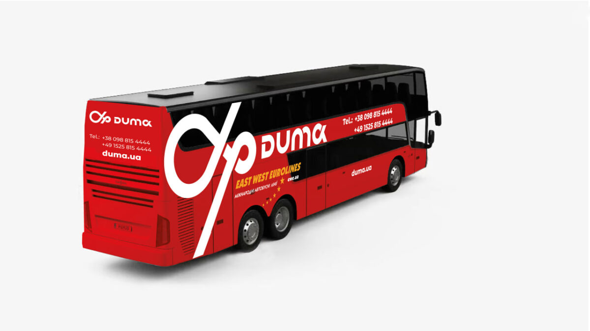
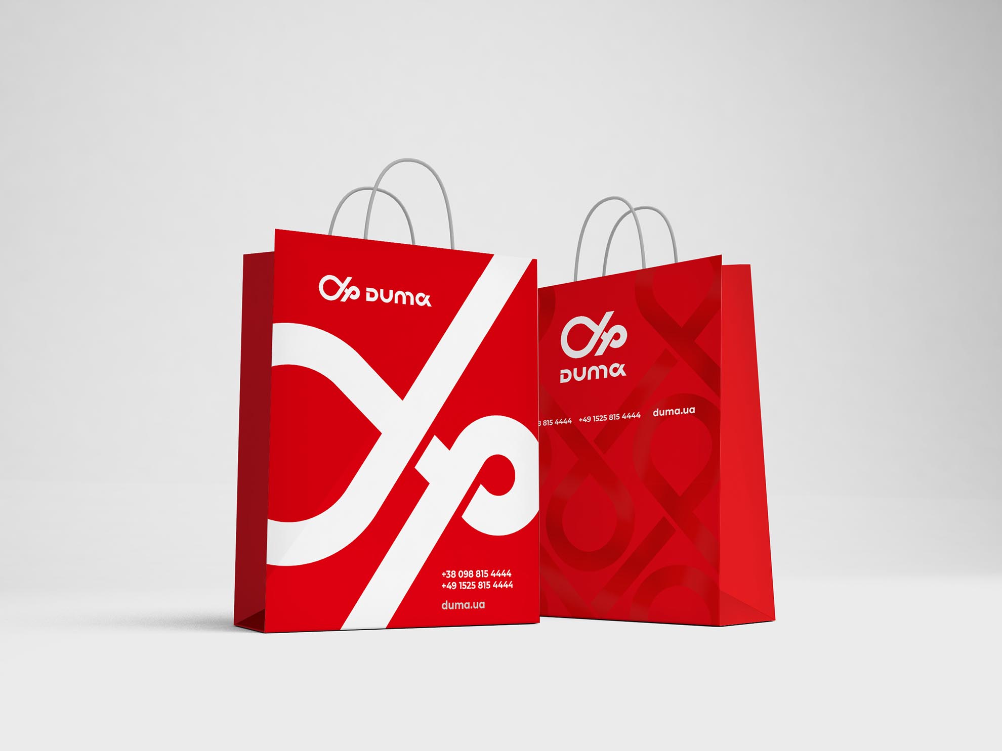
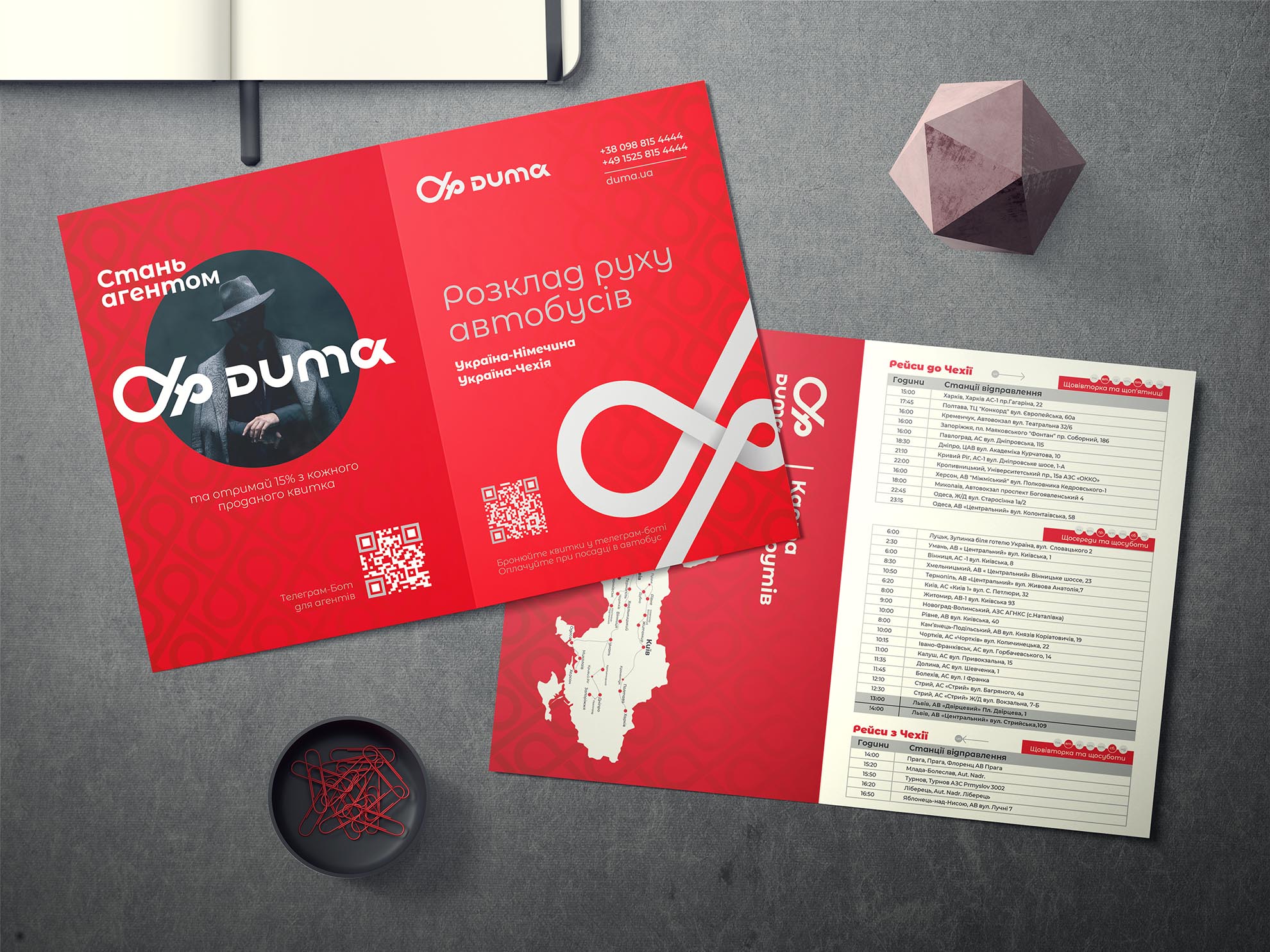
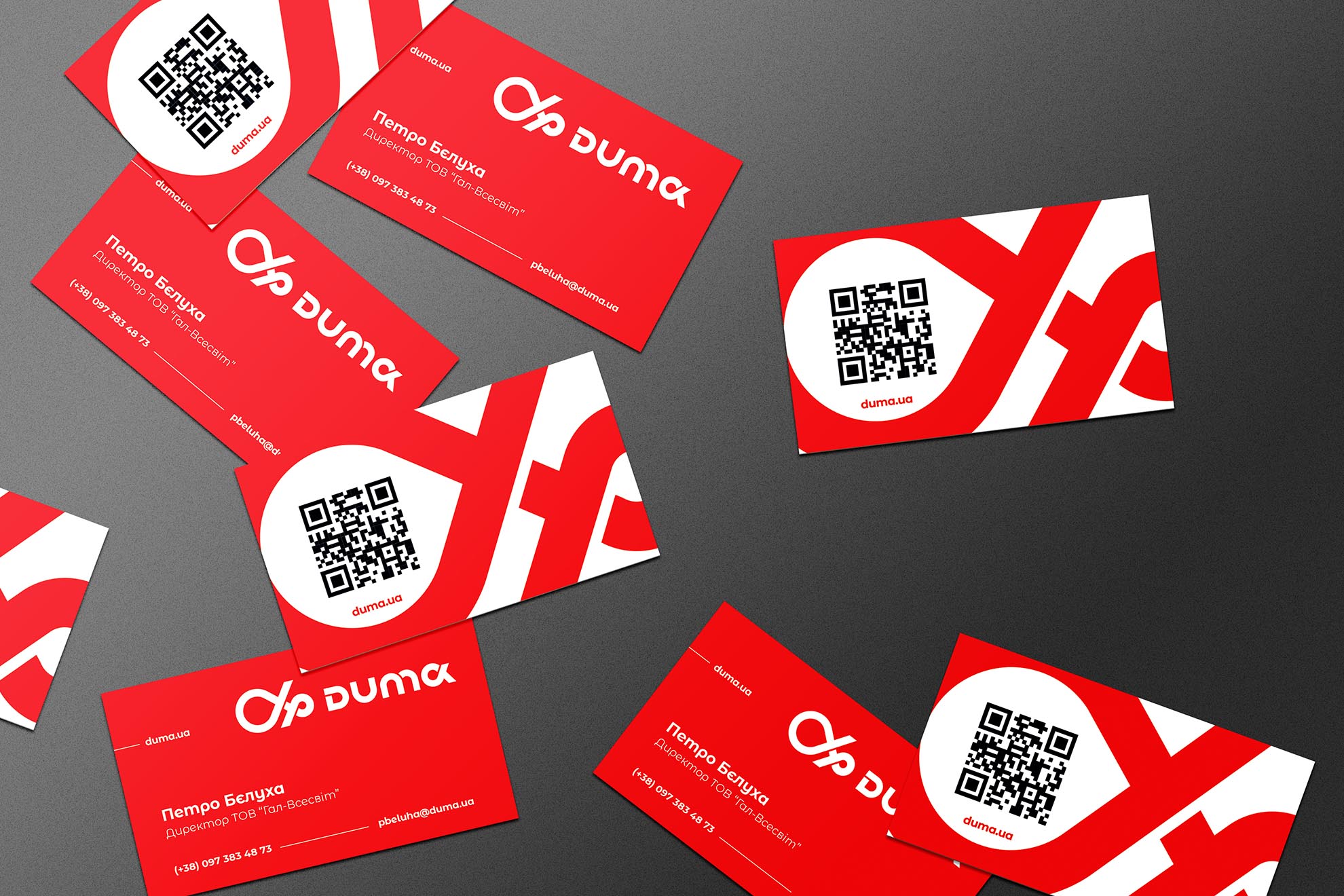
REBRANDING THAT REDEFINES ‘TRANSPORT’ AS ‘TOGETHERNESS’!
Are you familiar with East West Eurolines? That reliable carrier that always embarked on journeys with you. But times change, and so have we in our approach to passenger transportation. Being just buses is dull. We’ve decided to take a step forward and transform your trips into meetings and moments of unity!

🌟 A NEW IDENTITY
MOROZOV has crafted an entirely new image for the premium-class bus transport of @DUMA. The company’s mission is not only about ferrying passengers but also about uniting people. We firmly believe that the true magic of travel lies in the encounters at bus stations, the laughter, the conversations, and the unforgettable moments of joy.


❤️ HOW WE DO IT
We’ve made our buses even more comfortable and convenient for our customers. You can count on top-notch service and unforgettable experiences from every trip. We believe that bringing people together and fostering positive emotions are of utmost importance in these challenging times.

The visual identity features stylized transport routes endlessly intertwining. In the brand’s concept, these pathways symbolize infinite motion. This means the customer can rest assured, knowing they can plan their journey and always return home without a hitch.”


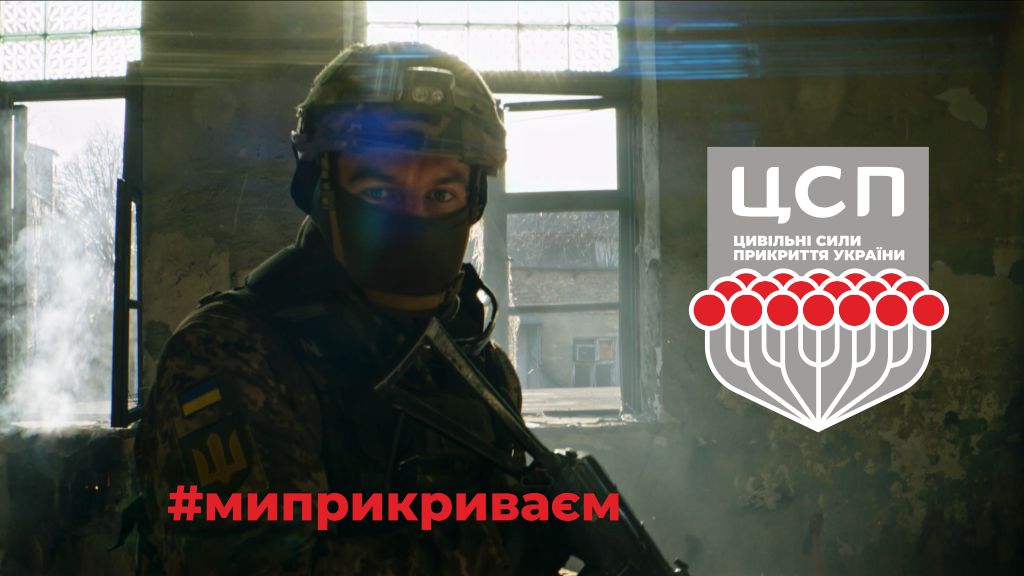
#weCover
Civilian Covering Forces
#weCover
Civilian Covering Forces
Usually, brands are created for specific organizations. But the brand of the Civil Covering Forces of Ukraine was created to unite all Ukrainian people working for the Victory in the rear.
#weCover
– a hashtag of a social video and the slogan of all Ukrainians who today serve the state in the rear. Actualizing the participation of civilians in the defense of the state creates a chain of moral support and helps to feel the value of their contribution. Awareness of being part of Ukraine’s largest “unit” – its Civilian Covering Forces – will help lift your spirits and improve morale amid disturbing news, sirens, and general tensions.
Imagine: you are not just a worker in your workplace or “just a volunteer after work”, but a real warrior of the Civilian Covering Forces

Project goals:
- support of the Armed Forces from the rear: every fighter can be sure that behind him – a strong cover of all areas of logistics, and loved ones in safety,
- emphasizing the importance of the work of all citizens who support Ukraine’s economy in the rear, create jobs, and help the army by volunteering.
Project idea:
- emphasize the importance of everyone’s contribution to the common cause of the Victory of Ukraine,
- to give all civilian workers a sense of the value of their work,
- to support morally all those to whom his efforts seem insufficient and
- to thank every Ukrainian.


The Civilian Covering Forces brand is the agency’s initiative, we created it for all conscious compatriots without exception. After all, they are already an organization numbering in the millions, and its coherence is admirable. Dedication to the common cause, inherent in every Ukrainian and willingness to help, insure and contribute – deserve recognition and encouragement, regardless of profession and role.
The bunch of kalyna, one of the symbols of Ukraine, acquires a new meaning: unity for a common goal. Courage and steadfastness of spirit multiply when we are together. Each in his place, we focus our efforts on help, support, and cover. The image of viburnum, sympathy, and optimism of Ukraine intertwines and strengthens the hero of the video, the collective image of a brave Ukrainian soldier.
The idea and symbolism of the Civilian Covering Forces of Ukraine found a response in the hearts of many Ukrainians, and the social video received more than a million views on Facebook.
We are and continue to be a worthy rear so that our defenders can confidently rely on us and believe that good is not small. We dream that the concept of the SPC of Ukraine will find a response in your hearts and the hashtag #weCover will be spread through information resources, increasing support, and unity.


Crypto Currency
Coins Backer
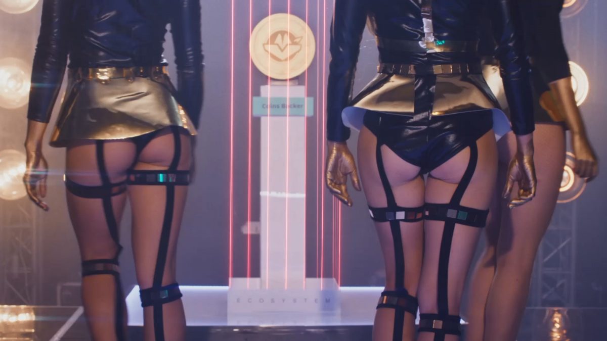
Commercial video for crypto currency CBE
Coins Backer
The high-quality advertising video is the future of entering the market. Regardless of the complexity and type of product, you can show its essence, benefits and attract the target audience to interact in minutes or less. This time MOROZOV.agency uses all the advantages of professional video production in an international-class project — to present the CBE crypto coin by Coin Backer.
The Task and the Challenge
Coin Backer company appealed to MOROZOV.agency with a need for a clear and vivid presentation of the crypto coin CBE in the giveaway format. The video should attract attention from the first seconds and lead the viewer straightforwardly to action: like it. Together with the customer, we defined the purposes of the promo video and its distribution as:
- Organic traffic and display on the company’s Youtube channel,
- Advertising on Youtube,
- pre-roll for other videos.
The Innovative Message, the Traditional Associative Series
The more complex the concepts we need to convey are, the simpler and clearer visual range we accompany them. The new decentralized AMM exchange with wide and developing ecosystem needed a clear presentation, and the customer, Coin Backer, had an idea of the video’s components. Since entering the online world was organized in the format of a giveaway, the primary associations were luxury, brightness, and festivity. According to the client’s wishes, the dancers around the main prize were to provide these emotional and associative series. And MOROZOV.agency revealed and supplemented the idea by associating the appearance of a new coin with a fashion show and car presentation.
When Every Movement and Every Glare Matters
Despite the seemingly simple components of the video, we managed to achieve clarity and coherence in it only thanks to the experience and qualifications of the MOROZOV.agency team. The play of light indicates the main subject and removes the emphasis from the models. Each beam from light sources and shiny objects concentrically goes to the coin, emphasizing it. And when the audience’s maximum attention is focused on the screen, a call to action appears at the point of its greatest concentration. The hand involuntarily reaches out to like, and only then to go deeper to details of the giveaway.
One Promo Video, Three Functional Formats
Anticipating the advertising video to appear on various channels of marketing communication, we created its three versions:
- 30 seconds (primary) – for organic traffic and display on the Youtube channel of Coin Backer,
- 15 seconds – Youtube ad format,
- 6 seconds – pre-roll on Youtube.
15 sec
6 sec
Making Off
Due to the right accents, a clear call to action, and the fulfillment of all Coin Backer’s wishes, we brought the new AMM decentralized exchange with wide and developing ecosystem to the spotlight – in every sense of the word.
Proud of our cooperation, thank you for your trust!


Mascot for sport club
“Lviv Angels” Cheerleading Sports Club
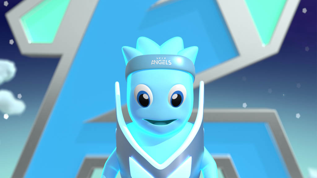
Team Spirit: Corporate Character Blym for the “Lviv Angels” Cheerleading Sports Club
“Lviv Angels” Cheerleading Sports Club
Building relationships with the target audience community is one of the main tasks of the brand. Establishing an emotional connection and understanding are crucial in this context. A mascot, a corporate character, is an excellent tool for expressing an emotional palette, increasing the team’s enthusiasm, and rising the interest in the brand. MOROZOV.agency created a character named Blym during the rebranding of the sports cheerleading club “Lviv Angels.”
The cheerleading club “Lviv Angels” consists of over 12 sporting sections, headed by 15 masters of sport. The team has repeatedly won all-Ukrainian competitions, conquered the Bronze of the European Championship 2017 in Prague, and the Silver of the European Championship 2018 in Helsinki.
The task and the goal
We faced the challenge to create:
- a talismanic character, but not a costume in which one of the cheerleaders of the team performs,
- a friend superhero, but without reference to the well-known types,
- a supernatural identity, but without religious or cosmic connotations.
Who was created with such conditions and creativity of the MOROZOV agency? Meet Blym.


The team’s soul
Blym is a charming character. He could be an angel or the image of a soul in a cartoon. We decided that Blym’s essence is the emotion of support. The inner superhero, who lives amid every athlete and knows the best words of encouragement in the world, when it is necessary to overcome yourself for a new achievement. Professional sport has a lot of these achievements. And in the daily training of cheerleaders unite into years of hard work, physical exertion, work on flexibility, and other challenges, which cannot do without mutual moral support. It would be nice if someone could whisper the necessary words in your ear, both to the team members and coaches.


“Lviv Angels are a power!
Support wings take us higher!
Believe and never stop!
Your Superheroes Club.”
For Real Men
«Hetman» vodka brand
TV commercial. For Real Men. The Hetman Class Quality
«Hetman» vodka brand
The task:
- Develop a script and communication messages based on the actual slogan “Hetman Class Quality”
- Form a vision around the principle: “We ensure the impeccable quality of Ukrainian alcohol.”
- Maintain a 40+ audience and increase brand relevance for a 30+ audience.
- Modernize the brand.
The result
The work resulted in an advertising campaign on more than 15 central television channels.
We decided to modernize the brand straightforwardly. With the key message: “Yes, we were relevant yesterday, relevant today, and will be relevant tomorrow.”
Even at the stage of creating the script, we understood the brand philosophy as the video’s main point and focused on its renewal.
We couldn’t do that in prose, so poetry came out:
“For real men and highest ranks,
For their worthy party
Until this day, we have remained
The glass of art and hearty!”
MOROZOV agency embodied “Journey in Time” in a commercial video with a combination of past and present images. The video shows a fun party in the folk style with a sharp transition to a modern feast.
15-second version
Backstage
It is noteworthy that during the filming of the commercial “Hetman Class Quality” the roles of Cossacks and secular people in the feast were performed by the same actors.
The table was set with real treats, which made the video production process more difficult for both the film crew and the actors.


WELLcome to Well Towers
WELL Towers appart complex

WELLcome to Well Towers, the European quality residential complex
WELL Towers appart complex
The task:
- to form a reasoned image of business-class housing construction for residential and commercial purposes,
- develop the brand identity for use in promotional materials,
- bring the benefits of residential and commercial real estate WELL Towers through the slogan and visual presence of the brand.

A dynamic logo to win the dynamic competition
MOROZOV.agency created an animated version of the logo communicating the speed of construction and reliability of Well Towers apartments.

Even the static version of the logo conveys movement, clarity, and a sense of height:
- the horizontal lines of the letter E show horizontal movement, which creates an association with stability,
- two vertical guides of the letters L go up endlessly symbolizing the construction speed and the success of the apartments’ and commercial spaces’ owners.
- corporate colors are concise and stylish. They convey a sense of elitism, sophistication, purity, and modernity.


Different colors of the logo can be used to mark different types of spaces. Each logo color can have a unique descriptor allowing you to distinguish between real estate types and see the range of offers.


Branded pattern and plenty of options for commercial use


The pattern in the form of rectangles and vector slashes also symbolizes construction and movement. Thin lines look stylish in all defined color combinations you can use on endless branded items, from office furniture to badges and business cards.


Well-standard residential property is a wise investment in the future
Branding made materials for the promotion of WELL Towers residential complex fundamentally distinguish among apartments and commercial real estate in the market of new buildings. The MOROZOV agency team managed to create an identity leading to:
- progressive solvent young people’s paying attention to apartments in new WELL Towers buildings,
- commercial real estate in the WELL Towers complex’s attractiveness for investors,
- visual associations of the appropriate level for a European-class housing in the center of Lviv


The higher the competition, the more you need to see and broadcast your unique value proposition through the brand. At MOROZOV.agenc, we have ambitions for such complex tasks.
New Brand for Exclusive Antiques
OWT

Old Wood Technologies: a New Brand for exclusive antiques barn wood
Old Wood Technologies
Old Wood Technologies is a manufacturer of decorative materials for barn interiors, a new trend in eco-materials.

Goals
Together with Old Wood Technologies, we have identified the following main objectives of cooperation:
- rebranding and logo redesign for creating the proper consumer associations,
- targeting two groups of audiences: interior designers who want to sell exclusive solutions and homeowners who want to create a unique atmosphere in them,
- creating a promotional video for the new brand presentation,
- creating promotional materials: subject and image photography of the product,
- creating integrated product images for use in design software.
The main goal is to create the image of an exclusive, ecological product and introduce fashion and demand for barn wood.
Logo Redesign
In collaboration, we have developed a new modern minimalist font logo, consisting of the abbreviation Old Wood Technologies, OWT.
Simplicity and lack of over-processing are old wood values that we managed to pass on in the company’s identity.


Honest photoset of products for customers


Textures and models for designers and architects


Digital advertising banners


The rebranding brought Old Wood Technologies to market, created a brand image, and explained its content to the primary target audience.
MOROZOV.agency team is proud of the cooperation and grateful for the opportunity to touch the new progressive trends in old wood, literally and figuratively. We believe that the future of eco-design is based on such technologies and companies like Old Wood Technologies.
The art of sole production
Soleart Style


The art of sole production: branding for Soleart.style
Soleart Style
A manufacturer of two-tone ethyl vinyl acetate (EVA) soles came to MOROZOV.agency, and we immediately realized the cooperation’s ability to be exciting. Soleart.style products have nothing to do with gray-black monotony, the stereotype connected with the word “sole.” So the MOROZOV.agency team decided to make the brand and its logo just as bright and full-color.

The brand’s essence: innovators and fans of their business
Together with Soleart.style, we identified the following key points that needed implementation of branding tools:
- innovation in the production of EVA soles
- European quality standards and technological reliability,
- an artistic approach to design and production.
The task of creating and designing an innovative, eloquent, and bright brand, its logo and identity, as well as a strategy for their use in merchandising, arose for us.
The target audience — footwear companies and enterprises, network clients, and wholesale clients. These groups require the clearest possible conveyance of the benefits of the product and the benefits of cooperation.

A rebellious logo
MOROZOV.agency created the font logo of Soleart.style where each letter has a character and meaning:


- the letter “e” consciously disagrees with everyone and creates the prospect of growth. Its outlines are simultaneously serving as exaggerated bow laces in the counter form with the letter “l” and the inscription “style” at the bottom.
- the inscription “style” is deliberately hidden and does not distract from the main proper name. The conversational name of the company will still remain “Soleart”.
- The logo, like the sole of the company’s production, consists of 2 parts: a large “soleart” and a smaller “style,” where the word “style” works as a metaphor for the sole located under the letters “l” and “e.”
- the horizontal lines of the letters “r, t” show a rebellious nature, breaking out of statics and creating a curve. In this line, you can see the rise of the foot, an element that logically formed the basis of visual identity.
Color… more color!
The MOROZOV.agency team has identified three primary corporate colors and a more extensive palette of their shades. In addition, separate color palettes decorate each collection of soles: for men’s, women’s, children’s, and unisex shoes.


“Two-component logo for a two-component colored sole. And in general, soles and shoes are all about the number “two”


Pattern and icons for merchandising
Additional visual elements emphasize the corporate style and allow the creation of stylish accessories with company symbols.


European quality of the sole!
That is every potential buyer’s or partner’s impression at any point of contact with the brand.
In cooperation with MOROZOV.agency, the brand received:
- a vivid and recognizable identity,
- classy corporate style elements,
- a professional website and other visual and textual tools to increase brand confidence,
- increased interest of the target audience in a new product, a two-tone sole made from EVA.


Meeting the President
President Vodka
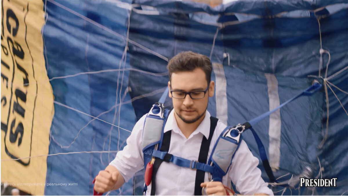
Meeting the President
President Vodka
The task:
- Develop a script and communications for the brand’s entering the market.
- Shooting and producing a video.
- Through the repetition of the name “President”, create an association with alcoholic beverages, and spread it among the target audience.
- Customer’s wishes: cold and snowy weather in the frame.
The result: Find a slot for the meeting! We are meeting the з “President”
«Знайди час для зустрічі! Зустрічаємося з „Президентом“»
We used the next methods, working on the campaign:
- Audience segmentation. Every promo video is targeted at a special group, therefore, people of different ages, social statuses, and gender appear in advertising.
- The «programming» of the ТМ’s name. The only phrase “Meeting the President” sounds in the commercial video, for the audience’s remembering the President ™ name.
- Keeping the viewer’s attention. We created an intrigue to keep advertising not intrusive but exciting, instead.
Backstage
MOROZOV production faced the task of shooting winter scenes in May at a temperature of +20 ° C. We took general shots at the top of Dragobrat Mountain, as it was still snowy there. Filming magic made the rest.


Sports Club of Superheroes
Cheerleading Club Lviv Angels
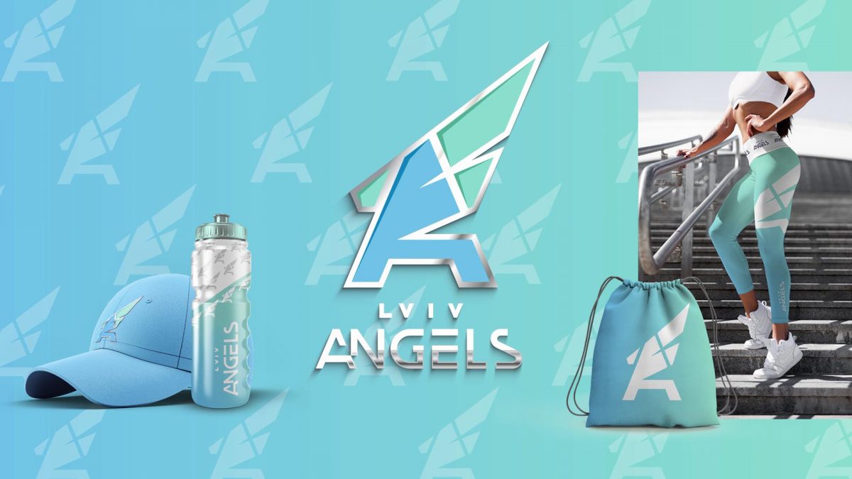
A Grown-Up Rebranding of the Kids Sport Club
Lviv Angels
The Lviv Angels cheerleading club has been creating bright shows and filling sports events with energy since 2012. During this time, the Angel teammates grew from 5-6 yeared children into charming teenagers, formed new values of the club, and significantly changed the team’s perception by the audience.
The team has repeatedly won all-Ukrainian competitions, conquered the Bronze of the European Championship 2017 in Prague, and the Silver of the European Championship 2018 in Helsinki.
“Grown out of an old brand”: the task and the challenge
Thus, the need for a new positioning appeared from within. And the society demands a mobile, healthy lifestyle for teenagers, the promotion of team spirit, the availability of sports, regardless of gender or appearance.
We were faced with the task of reflecting all the changes in positioning and conveying them through the new image of the brand. An effective brand presentation became another task.

The Professional Sports Club of Superheroes: the strategy and the plan
In cooperation with the club “Lviv Angels”, MOROZOV.agency identified the following steps for rebranding:
Positioning change:
- from the children’s section to the professional sports club,
- from “a girls’ sport” to “sport for everyone” with no age, gender, and figure restrictions.
Development of a new club identity, corresponding to the new positioning:
- a font logo,
- the emblem of the club.
A strategy for applying a new identity in merchandising:
- use of the logo and emblem on the training uniform, accessories, etc.
Drive and independence in the logo and the emblem
Insight: Cheerleaders are emotional leaders going out on the game court to set the mood.
Logo and emblem developed by MOROZOV.agency:
- convey independence and supremacy – in capital letters A,
- encourage to straighten the shoulders – a symbol of the wings,
- connect athletes with their hometown – the outlines of a lion,
- stimulate the persistent progress towards the goal – vector and movement from right to left, with increasing size of lines.
The logo and emblem can be used both together and separately on different elements of the sports style of the club members.


Slogan
Your Club of Superheroes
The slogan combines the ideas of “superhero in everyone” and “community of superheroes”, where joining the community is desirable and valuable. The Club of Superheroes is a place where existing team members are recognized, and the new ones are welcomed.


Superheroes wearing Instagram masks: An Online Campaign of an Updated Brand Presentation
Lviv Angels in a new form and with new content appeared on the social network:
- the new design of coaches’ and club members’ profiles,
- a vivid promo video showing the new values of the club and presenting the new slogan,
- Instagram masks Neon, Wings, and SuperHero to increase the organic reach of the audience.


The results did not take long:
- Lviv Angels’ new style became popular and recognizable thanks to the organic reach of almost 44,000 people.
- the club received more fans and many new requests for training participation from boys and girls of all ages,
- the teammates became even more united thanks to the entertaining content created with the help of Instagram masks and a poetic slogan.
The embodiment of team spirit: a mascot named Blym.
We created a corporate character of the Lviv Angels club named Blym. There is a separate case study on the website about him. His image meets and accompanies athletes and their parents. Blym speaks to them from social networks and inscriptions on the doors and walls of gyms, locker rooms, and official spaces.


Lviv Angels are a power!
Support wings take us higher!
Believe and never stop!
Your Superheroes Club.
MOROZOV advertising agency is proud of its cooperation and rejoices in its success. Business growth, positioning change, the new direction of activity — there can be even more backgrounds for rebranding. So if the old brand does not fit anymore, we invite you to talk about it and find a solution together.